Menu Art
Searchlight Hotel » Devlog
Hello everyone! It's Ruby once again. This week, I'd like to tell you all about the menu art I created.
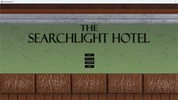
Our team realized that the picture we were using for the menu, an image of one of the hotel walls, was rather plain and didn't do a good job of giving our players information about our story.
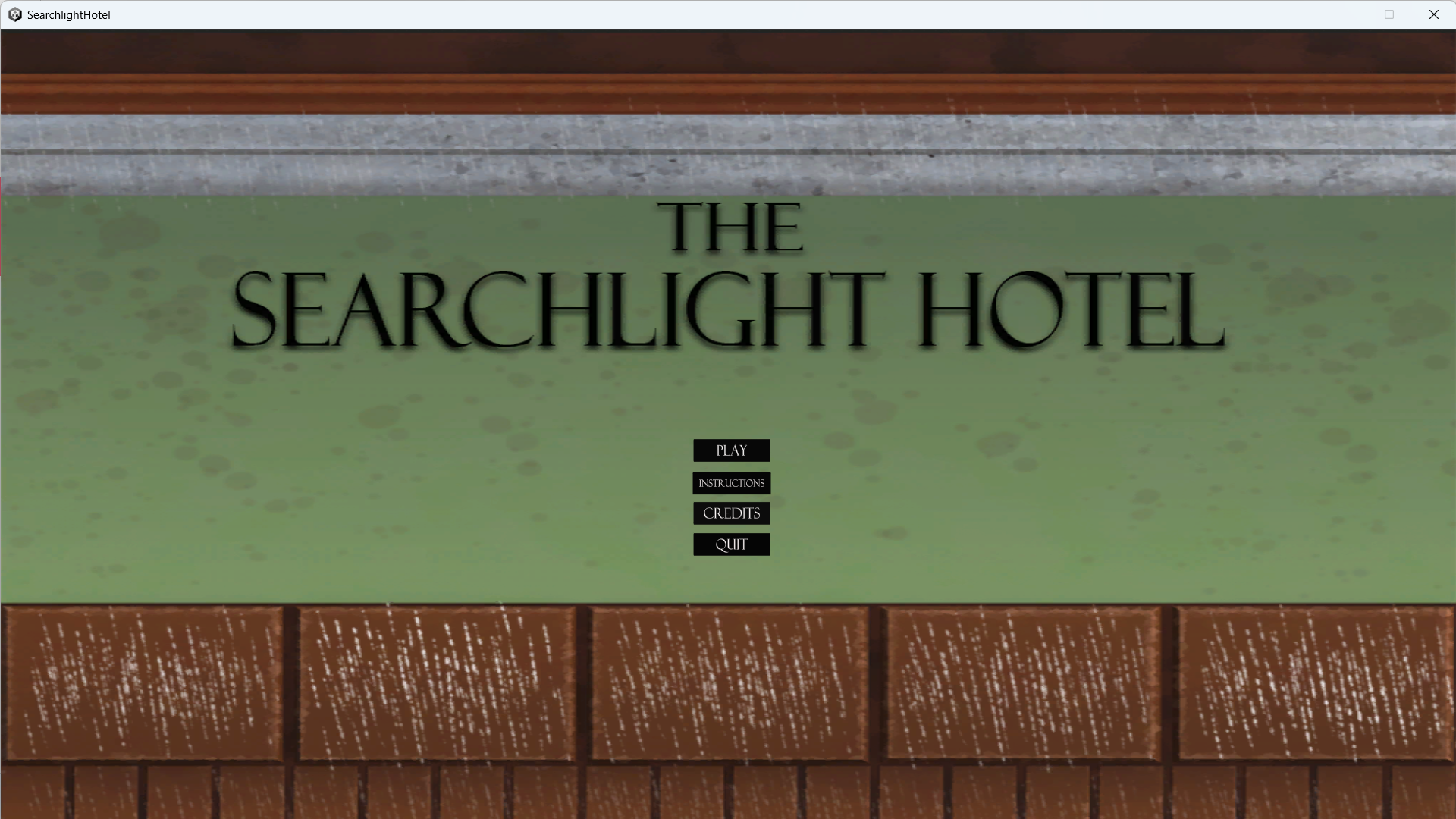
We decided I should make some new art for it, and did a little brainstorming over what the new picture should be. We would have two new pictures, one of which I'll show the process for here.
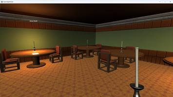
This picture was meant to show the Searchlight Hotel in its heyday. The dining room seemed like a good choice for people to gather and enjoy themselves back when the hotel was a successful business. I went into the beta build of the game to get a good reference image of the room and furniture.

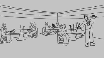
I made a very rough sketch of the room and furniture based on this screenshot, and then added in some people.
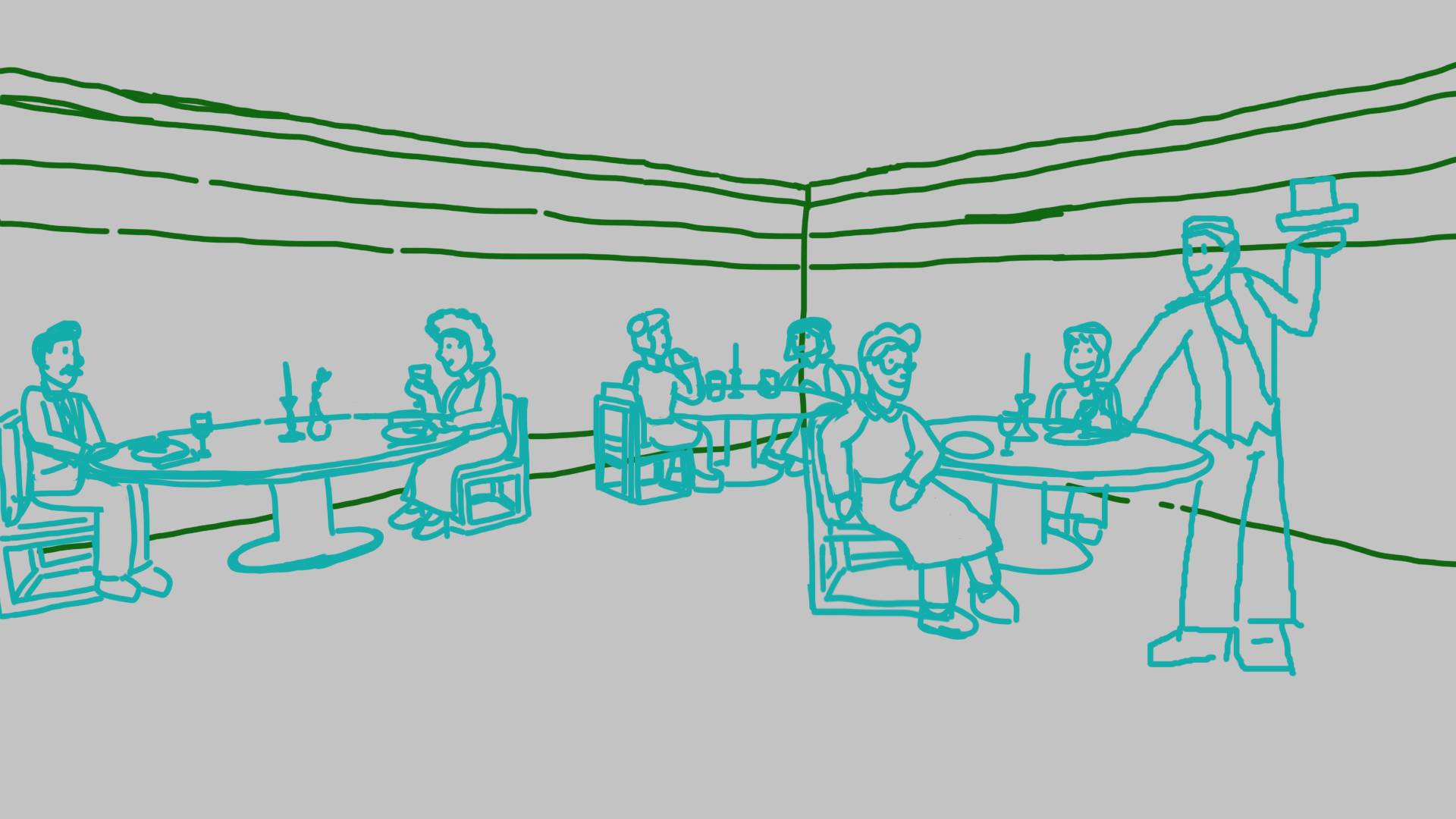
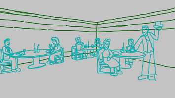
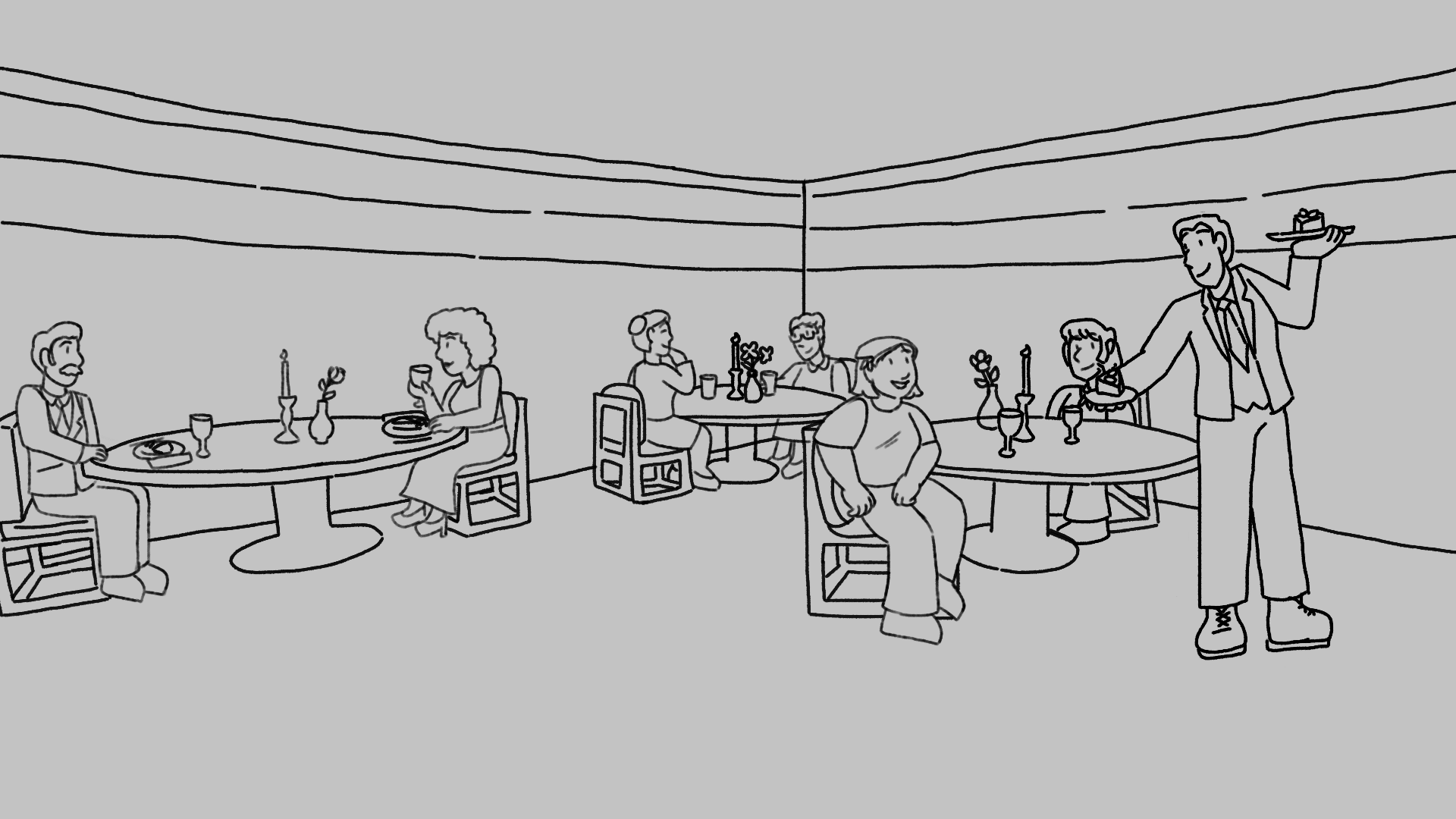
Clearly, this version of the picture was a little underdone, so I refined it in the lineart stage. Notably, the waiter is no longer standing like he's about to fall over.
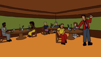
Finally, it was time for color. Rather than the illustrative marker style I used for the postcard, I went for simple and clean flat color. I wanted to keep the color palette cohesive and accurate to the 70s. I especially like the design of the yellow shirt and bandana on the woman on the right. However, I did make one mistake... I completely forgot the pattern on the carpet. Whoops!
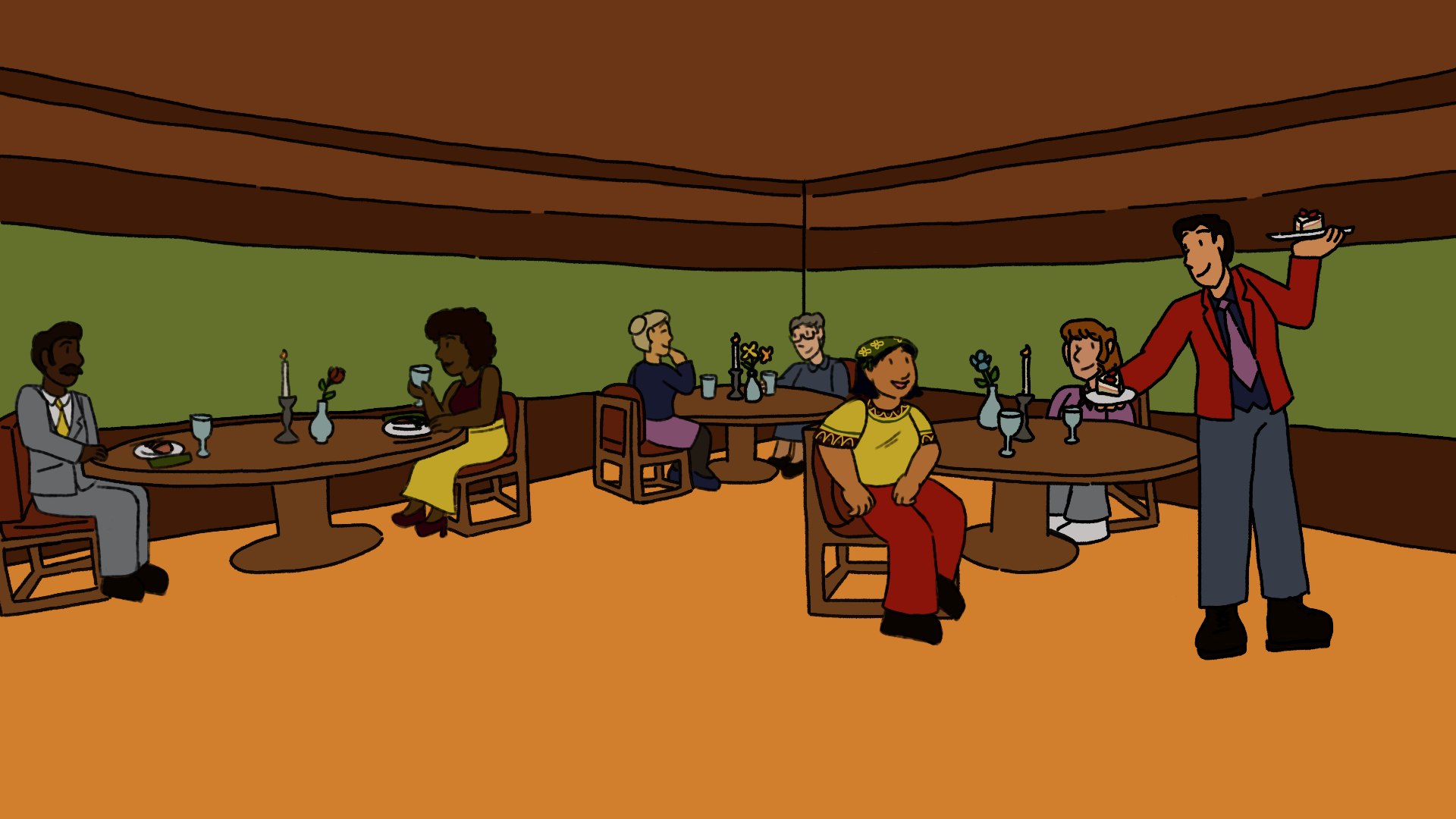
All in all, I really enjoyed working on these pieces, and I hope you enjoy looking at the one I shared!
Keep Seeking.
-Ruby P.
Get Searchlight Hotel
Searchlight Hotel
Play through the story of a girl looking for her lost brother in the Searchlight Hotel.
| Status | In development |
| Author | crcherry |
| Genre | Adventure |
More posts
- The Searchlight Hotel PostmortemJul 24, 2023
- Art ImplementationJul 19, 2023
- Audio DesignJul 18, 2023
- State of the Game: Post BetaJul 11, 2023
- How To: Level DesignJun 28, 2023
- Art Concepts and ExecutionJun 25, 2023
- How I make Stylized AssetsJun 19, 2023
- Concept ArtJun 13, 2023
- Level Design OverviewJun 05, 2023
Leave a comment
Log in with itch.io to leave a comment.