How I make Stylized Assets
Hey everyone, I'm Andrew Krieps. I'm the modular asset artist for the game. I'm here to talk about how I stylize my assets for the game. This guide is not for beginners to modeling, uving, or texturing. You should have a firm grasp of these things before trying to do more advanced stylization.
For stylized assets I mainly use blender as it has access to quick and easy sculpting tools which are important for making a good normal map later.
First I wanna talk about why stylization is important, especially for indie games. Contrary to what it may seem, with 3D models, stylization can be very hard to achieve. Much of the tools for 3D modeling and even more so texturing, have been developed to make getting a realistic look more easily achievable. Plus it's hard to make 3D assets look good and stylized at the same time because you have to be a lot more deliberate with every single aspect. Sculpting tools have thankfully made this a lot easier, but it still takes a good amount of effort. But it is effort well spent. A clear sense of style can drastically improve the visual aspects of a game.
Today I'm gonna be making essentially a large piece of rock rubble, but these concepts can be applied to the whole process. We'll start off with the model of course. We want to take our starting cube and turn it into a lopsided solid with a bunch of exaggerated shapes. It takes time to develop an eye for what looks good but just keep chiseling away at it till you have a good starting shape.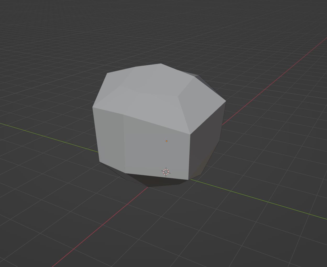
We want to start out with this irregular shape that isn't too far off from what we want. It's hard to express with this rock, but if we were making something that had more normalized angles (Like a box) we'd want to break those right angle as much as possible (But not going too far off). This make it visually more distinct than just having perfect right angles. But make sure there are still some clear hard angles.
Once we have a good starting solid, we want rename this model to <object>_LowPoly, and to duplicate it. Rename the duplicate to <object>_HighPoly. This is the one we are going to go into sculpting mode and smooth out those hard edges. I would recommend having a drawing tablet for sculpting.
Before we start sculpting, we need some geometry we can actually manipulate. So we are going to subdivide the surface a bunch of times. However we don't want to smooth it! In blender this is easy to do. In the subdivide surface modifier, select the "Simple" subdivision algorithm. This keeps the shape entirely intact. Optionally after subdividing it like this, you can subdivide it one more time, this time allowing smoothing to bend the edges a bit. This gives us a slight head start on the next step.
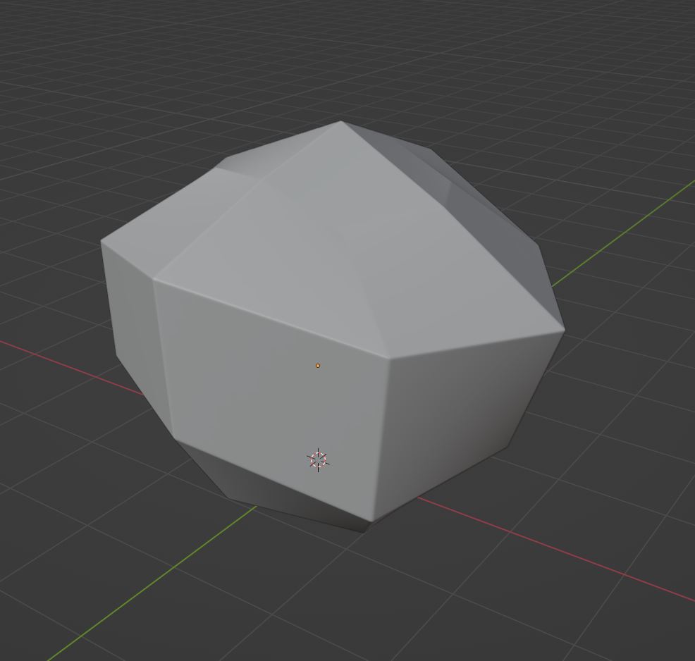
Technically speaking you could stop modeling here, and get a decent stylized asset from textures alone. However I will go a bit further to get something a little more in line with our game's style.
After this we will begin sculpting. If you are using blender you can simply just switch over to sculpting mode. But you can also export this high poly model to a different sculpting program such as Zbrush. If you're in blender, choose the Scrape brush. Go along the edges to create a smooth edge. Do this multiple times to flatten it back down to an edge. Use a combination of other brushes to get a multi-faceted look that has some rough beat up looking edges.
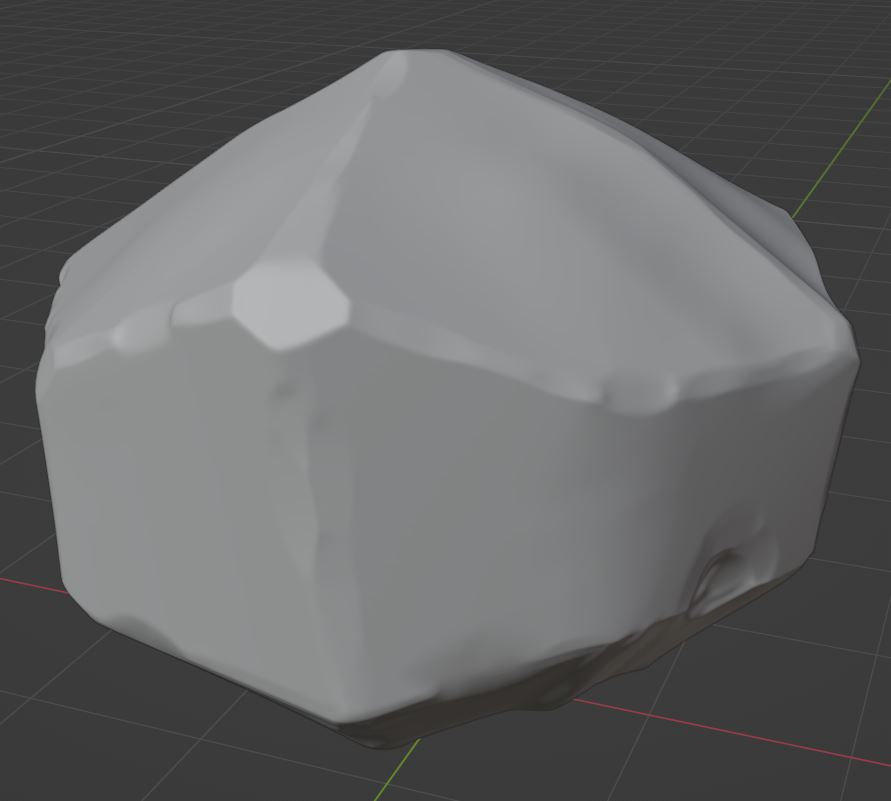
At this point- as long as you haven't made any major changes to the shape of the model, you can skip this next step. To check this turn on wireframe in blender and select the high poly model to light it up orange. Unhide the low poly so you can see it's outline as well. Then circle around the models and see where they don't align. I'm going to put in a few screen shots so you can visually see what I mean.
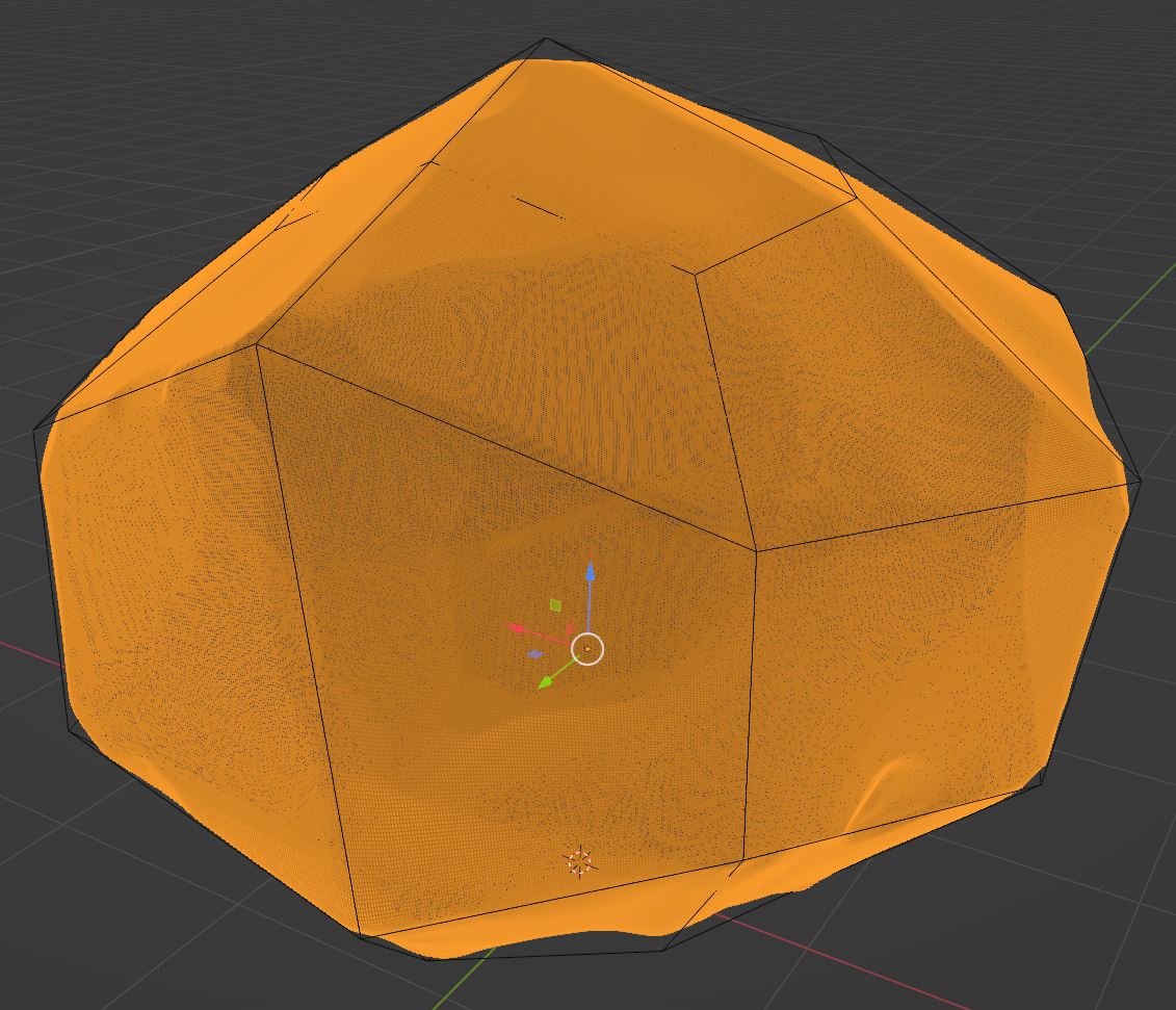
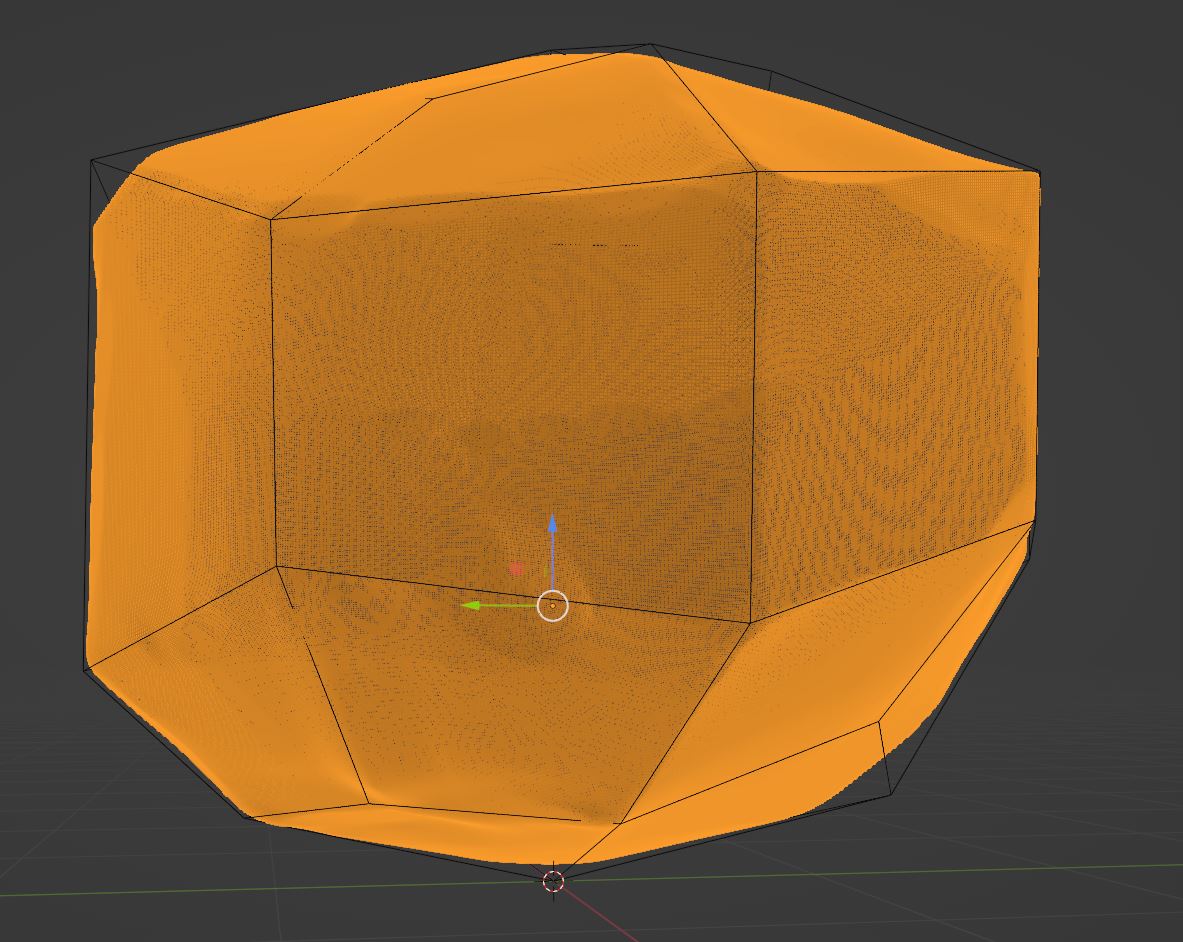
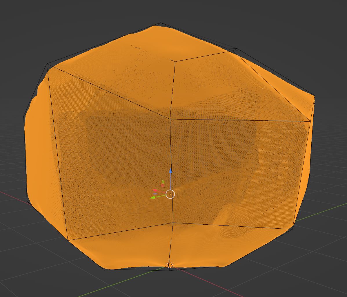
On the 2nd and 3rd images you can see where the Low poly model gets a bit of a ways away from the high poly. You should try to make sure they're as close as possible. At this point you have 2 options. You can keep the low poly still really low poly and adjust each vertex manually; or you can subdivide it once or twice (But no more!) and then shrink wrap it to the high poly model. This low poly is way lower poly than I need so I'm going to do the second option.
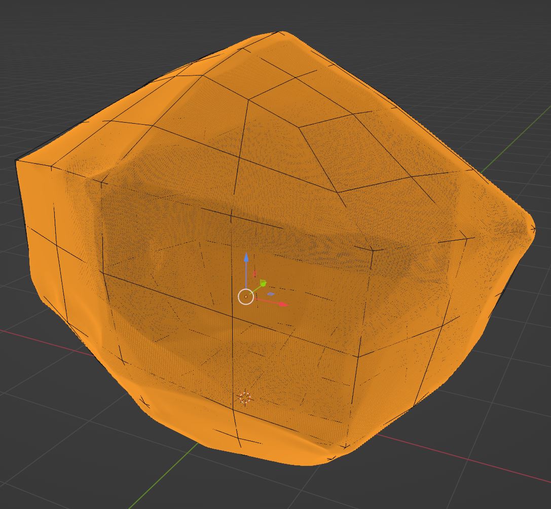
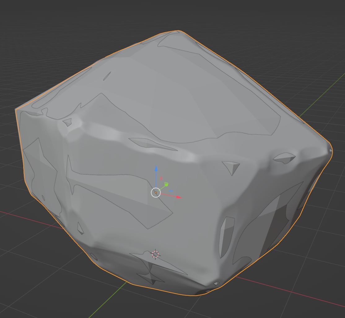
Now that our models are complete we can UV the low poly model to get it ready for texturing. Next you need to UV only your low poly. This isn't going to be a tutorial for UVing. Try too keep good UVing practices, but since my texture's aren't going to be too busy, I won't need to worry about them. If you're object's style has a busier texture, you will need to get a better UV. Once you've UVed your low poly, export both the low and high poly models in OBJ or FBX format. Once you have them UVed and exported, open up your texturing software. I will be using substance.
Once in substance do your normal set up, and then go to bake mesh maps. Once in here, add the high poly model to the list of high definition meshes. I usually recommend just doubling pretty much all dials for all the maps that have one for cleaner maps. I also recommend turning on at least a little bit of antialiasing. Bake your mesh maps and then we'll get to probably the easiest (At least for my style) but still most important part, texturing.
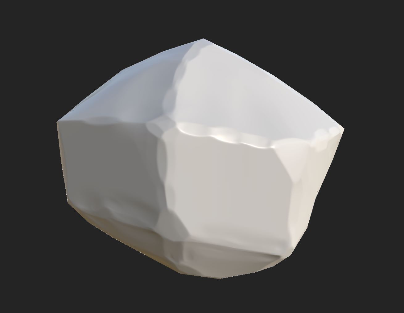
My style has 3 core things; Solid color (With some amount of discoloration), a vertical gradient, and edge wear. First though we need to set up a base layer to tell the rest of the model how to look. In this base layer you want to set up a couple of things. For one, if your object is shiny, lower the roughness. If your object is metallic, bump the metallic up. We're also going to set a base color.
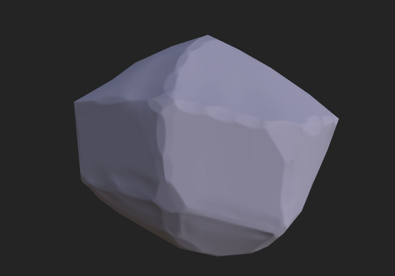
Next thing we're gonna do is set up a gradient. This is a really effecting starting point for making a stylized 3D piece nearly every time. There are 2 ways to do this. With a world position generator, or a gradient texture. Depending on the shape and UV of your model you'll have to find out which works best for you. At the end, the darker color should be at the bottom of the model itself.
After the Gradiant add some discoloration on top of the base layer. This can be done by choosing any texture- although the more variance in that texture the better- and then adding blur slope filter on top of it. This should be below the gradient in the layers.
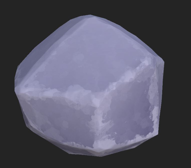
Finally for a top layer, choose a bright color brighter than the gradient, and use a metal edge wear generator. This will give you a really solid start, that a blur slope filter can handle very very well to add a finishing touch. Here's how my rock turned out.
Thanks for reading my blog post this week, hope it helps someone figure out how to get a more stylized look.
Get Searchlight Hotel
Searchlight Hotel
Play through the story of a girl looking for her lost brother in the Searchlight Hotel.
| Status | In development |
| Author | crcherry |
| Genre | Adventure |
More posts
- The Searchlight Hotel PostmortemJul 24, 2023
- Art ImplementationJul 19, 2023
- Audio DesignJul 18, 2023
- State of the Game: Post BetaJul 11, 2023
- Menu ArtJul 04, 2023
- How To: Level DesignJun 28, 2023
- Art Concepts and ExecutionJun 25, 2023
- Concept ArtJun 13, 2023
- Level Design OverviewJun 05, 2023
Leave a comment
Log in with itch.io to leave a comment.